Netflix Queue Manager v2.2
style changes
After several requests, the titles have been made left-justified. This required some restructuring of the page elements so that the necessary styles could be applied (it’s harder than it should be to create fixed-width layouts without using tables). All the sorting routines had to be tweaked to accomodate the changed structure.
You may also notice:
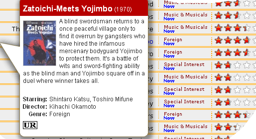
- The “Releases on DVD” part of an unreleased title’s availability is now removed. This keeps the release date text from bleeding into the star column. (I think the text used to be different, something like “Available on …”)
- The BOB function seems to have benefited from the structure changes. In IE, BOB appears in the proper place. In Firefox, the horizontal position is still incorrect, but now it appears to the far left. This is an improvement though, as now the BOB now won’t appear over the current cursor position. Update: since first posting the change the BOB now appears to be working fine in both IE and Firefox, so perhaps Netflix tweaked their positioning code a bit.
As usual, if you’ve previously used the Manager you may need to to a cache reset to see the new features properly.
Full instructions on installation and usage is located here.

